
knowledge
-

HTML Responsive Web Design: A Complete Beginner-Friendly Guide
In today’s multi-device world, a website must look great on phones, tablets, laptops, and large monitors. This is exactly what Responsive Web Design (RWD) solves. Responsive Web Design makes a website automatically adjust, resize, and adapt based on the user’s screen size—without requiring separate mobile or desktop versions. In this comprehensive guide, you’ll learn what…
-

What’s More Important: Refresh Rate or Screen Resolution?
When buying a new monitor, gaming laptop, or even a smartphone, you’ll often see two specs highlighted the most: screen resolution and refresh rate. Both matter — but they matter in different ways. Understanding which one is more important depends entirely on what you do: gaming, productivity, content creation, watching movies, or general browsing. This…
-
CSS Media Queries — The Complete Guide for Responsive Web Design
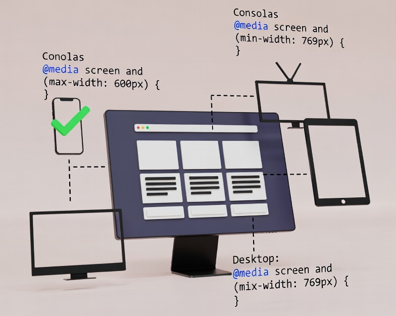
CSS Media Queries allow you to apply CSS rules only when certain conditions are met — such as screen width, device orientation, color scheme, or resolution. They’re the foundation of responsive web design. Basic Syntax Why Media Queries Matter Most Common Media Queries Start styling for small screens, then go up. Popular Screen Size Breakpoints…
-

Screen Resolution for Web Developers — The Ultimate Responsive Design Guide
Modern websites must look perfect across thousands of screen sizes — from tiny smartwatches to ultrawide monitors. For web developers, understanding screen resolution, viewport, pixel density, and breakpoints is essential for building a fully responsive experience. This guide gives you everything you need: concepts, tables, examples, and best practices. What Exactly Is Screen Resolution? Screen…
-

Common Screen Resolutions in 2026: Mobile, Desktop & Tablet
Screen resolutions in 2026 continue to evolve as displays become sharper, wider, and more pixel-dense. Whether you’re a developer, designer, marketer, or device reviewer, understanding the most widely used resolutions helps you optimize layout, UI, and media assets. For designers and developers, the critical metric is the Viewport Size (CSS Pixels)—the resolution the browser “sees”—rather…
-

Screen Resolution vs. Viewport Size — Why They’re Not the Same
Understanding the difference between screen resolution and viewport size is essential for designers, developers, and anyone optimizing a website for different devices. These two measurements often get mixed up — but they represent completely different things. Below is a clear breakdown to help you understand what each term means, how they work, and why they…
-

Screen Resolution: Everything You Need to Know (Full Guide)
Screen resolution is one of the most important technical aspects of any digital display — whether you’re using a laptop, desktop monitor, smartphone, or even a smart TV. It determines how sharp, clear, and detailed the visuals appear on your device. In this complete guide, we break down what screen resolution means, how it works,…