
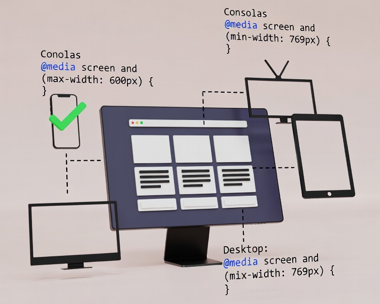
CSS Media Queries allow you to apply CSS rules only when certain conditions are met — such as screen width, device orientation, color scheme, or resolution.
They’re the foundation of responsive web design.
Basic Syntax
@media (condition) {
  /* styles apply when condition is true */
}
Why Media Queries Matter
- Make your website usable on all screen sizes
- Control layouts for mobile, tablet, and desktop
- Customize typography, grids, menus
- Reduce complexity by applying CSS only when needed
Most Common Media Queries
Start styling for small screens, then go up.
/* Phones */
@media (min-width: 480px) {}

/* Tablets */
@media (min-width: 768px) {}

/* Laptops */
@media (min-width: 1024px) {}

/* Desktops */
@media (min-width: 1280px) {}
Popular Screen Size Breakpoints
| Device | Breakpoint |
|---|---|
| Small Phones | 320px |
| iPhone (modern) | 375px |
| Large Phones | 414px |
| Tablets | 600–768px |
| Tablets Landscape | 1024px |
| Laptops | 1280px |
| Desktops | 1440px |
| Full HD monitors | 1920px |
Recommended Breakpoints to Use:
@media (max-width: 600px)  { /* mobile */ }
@media (min-width: 600px)  { /* tablets */ }
@media (min-width: 900px)  { /* tablet landscape */ }
@media (min-width: 1200px) { /* laptop */ }
@media (min-width: 1800px) { /* large desktops */ }
Media Query Types and Conditions
1. Width-based queries (most common)
Max-width
@media (max-width: 600px) {
  body { background: lightblue; }
}
Min-width
@media (min-width: 1024px) {
  body { background: green; }
}
2. Orientation Queries
Detects device position.
@media (orientation: portrait) {
  .image { height: 400px; }
}

@media (orientation: landscape) {
  .image { height: 200px; }
}
3. Dark Mode Queries
@media (prefers-color-scheme: dark) {
  body { background: #111; color: #eee; }
}
4. High DPI / Retina Displays
@media (min-resolution: 2dppx) {
  img { image-rendering: crisp-edges; }
}
Useful for:
- Retina MacBooks
- Modern smartphones
- 4K displays
5. Hover & Pointer Detection
Great for touch vs mouse devices.
@media (hover: none) {
  a:hover { text-decoration: none; }
}

@media (pointer: coarse) {
  /* touch devices */
  button { padding: 18px; }
}
Combining Multiple Conditions
You can join them using and, or, not.
@media (min-width: 768px) and (orientation: landscape) {
  /* tablet landscape */
}
@media (max-width: 600px), (orientation: portrait) {
/* applies if either condition is true */
}Mobile-First vs Desktop-First
Mobile First (recommended)
Use min-width queries.
- Loads CSS for smallest devices first
- Faster & more efficient
@media (min-width: 768px) {
  /* bigger screens */
}
Desktop First
Use max-width queries.
- Starts from large screens
- Less common today
@media (max-width: 1024px) {
  /* smaller screens */
}
Advanced Media Queries (Modern CSS)
Container Queries (2023+)
Changes styling based on the size of a container, not the viewport.
@container (min-width: 500px) {
  .card { display: flex; }
}
Forced Colors Mode
For accessibility and high-contrast themes.
@media (forced-colors: active) {
  * { forced-color-adjust: none; }
}
Reduced Motion
Detect users who prefer minimal animations.
@media (prefers-reduced-motion: reduce) {
  .animation { animation: none; }
}
Best Practices for Media Queries
- Use mobile-first approach
- Stick to a simple breakpoint system
- Avoid targeting specific devices
- Use responsive units (%, rem, vw, clamp())
- Test using Chrome DevTools + real devices
- Use container queries for components
Ready-to-Use Media Query Boilerplate
/* Mobile First Layout */
@media (min-width: 480px) { /* small phones */ }
@media (min-width: 768px) { /* tablets */ }
@media (min-width: 1024px) { /* laptops */ }
@media (min-width: 1280px) { /* desktops */ }
@media (min-width: 1536px) { /* large desktops */ }
Leave a Reply