What Is My Screen Resolution
The number above represents your screen/monitor resolution (in width and height).
This micro web utility helps you to find your monitor/screen resolutions. There is no need to do the cumbersome right click, properties, settings, etc, to find out your screen resolution.
If you need to change your screen resolution in Windows, follow these instructions.
1536 × 1.25 = 1920. Viewport shows the available CSS pixel size in your browser window.
Why screen resolution matters
Knowing your screen resolution and device pixel ratio helps when choosing image sizes, testing responsive layouts, and ensuring crisp visuals on high-DPR displays (like Retina). Use this tool to quickly copy values or share them with designers and developers.
- Use
window.innerWidthandinnerHeightto measure viewport size. - Use
window.devicePixelRatioto detect DPR and serve higher resolution images if needed.
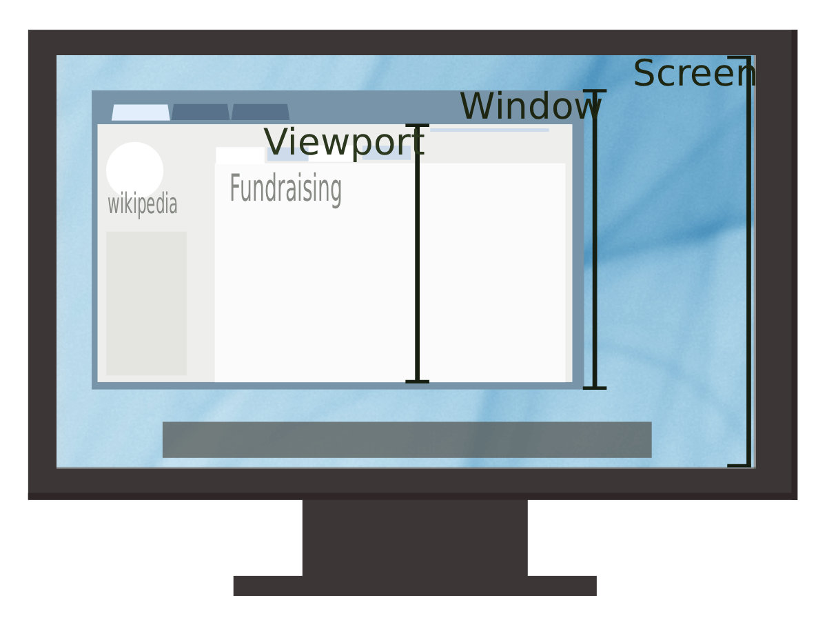
Screen resolution matters because it determines how sharp, clear, and detailed everything looks on your device. Higher resolutions provide crisper text, smoother images, better video and gaming quality, and more workspace for multitasking. It also affects responsive web design, UI layouts, display scaling, and overall user experience. Whether you’re designing, gaming, or simply browsing, your screen resolution directly influences clarity, performance, and how effectively content fits on your screen.
Common Screen Resolutions
Quick reference of common display resolutions, their aspect ratios, and total pixel counts. Useful for designers, developers, and anyone checking device specs.
| Resolution | Name | Aspect Ratio | Total Pixels | Typical Devices |
|---|---|---|---|---|
| 7680 × 4320 | 8K UHD | 16:9 | 33,177,600 | Emerging technology for high-end TVs |
| 3840 × 2160 | 4K UHD | 16:9 | 8,294,400 | High-end monitors, TVs |
| 2560 × 1440 | QHD / 1440p | 16:9 | 3,686,400 | Gaming monitors, prosumer laptops |
| 1920 × 1080 | Full HD (1080p) | 16:9 | 2,073,600 | Laptops, desktops, many monitors |
| 1536 × 864 | HD+ | ≈16:9 | 1,327,104 | Mid-range laptops (scaled displays) |
| 1366 × 768 | HD | ≈16:9 | 1,049,088 | Budget laptops |
| 1280 × 720 | HD (720p) | 16:9 | 921,600 | Small laptops, older devices |
| 1024 × 768 | XGA | 4:3 | 786,432 | Older monitors & tablets |
| 800 × 600 | SVGA | 4:3 | 480,000 | Very old displays / embedded devices |
| 3440 × 1440 | UltraWide (WQHD) | 21:9 | 4,953,600 | Ultrawide monitors (productivity & gaming) |
| 2560 × 1080 | UltraWide (UW-UXGA) | ≈21:9 | 2,764,800 | Ultrawide laptops & monitors |
Tip: Aspect ratio is width divided by height (e.g., 1920 ÷ 1080 = 16:9). Total pixels = width × height and indicates how many individual pixels make up the display.
About WhatIsMyScreenResolution.info
WhatIsMyScreenResolution.info is a fast, lightweight, and privacy-focused tool designed to instantly detect your screen resolution, browser viewport size, aspect ratio, pixel density, total pixels, and other display details. The website helps users quickly understand how their device is rendering content without needing to open settings or install software. Whether you're a developer testing responsive layouts, a designer working on UI elements, a gamer adjusting display settings, or simply a user curious about your device’s resolution, this tool provides accurate, real-time information in one click. We prioritize speed, simplicity, and accuracy — with no tracking, no cookies, and no unnecessary scripts — making it one of the most reliable screen testing utilities on the web.